It’s Wednesday and time for the funkie side of the design team to share our projects for the current challenge over at the Frilly and Funkie Challenge Blog!
The current challenge is hosted by team member Kathy who has chosen the theme PLANES, TRAINS AND AUTOMOBILES …Kathy says, “ Summer is a great time to travel. For this challenge, create a vintage or shabby chic travel themed project. Think folded maps, cruise ships, road signs, compasses, passports, trains, planes or automobiles. As long as your project features a travel theme, you’re headed in the right direction.”
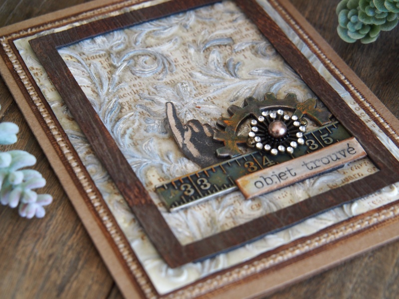
Having recently spent a week in beautiful rural France with family, I was very much in the mood for this theme.
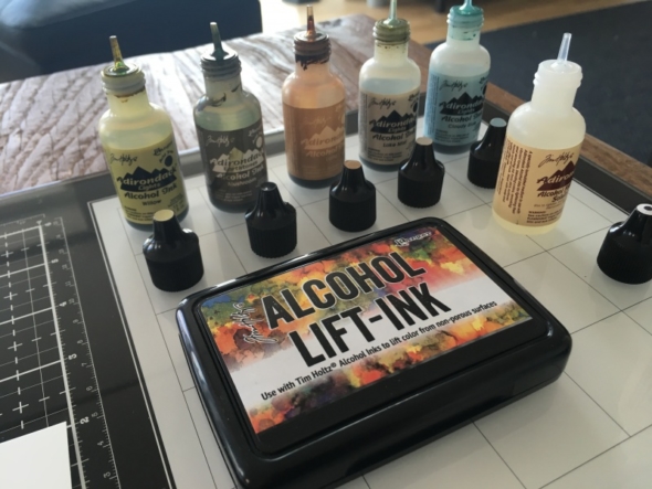
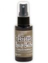
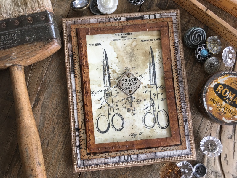
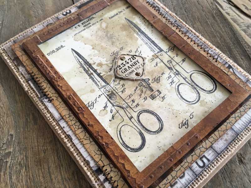
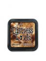
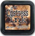
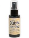
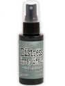
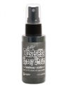
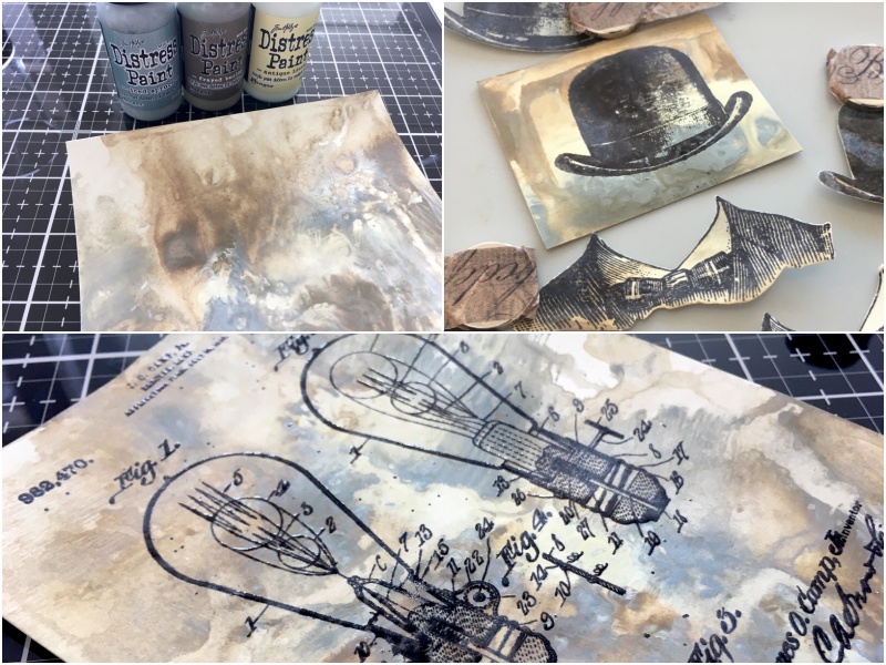
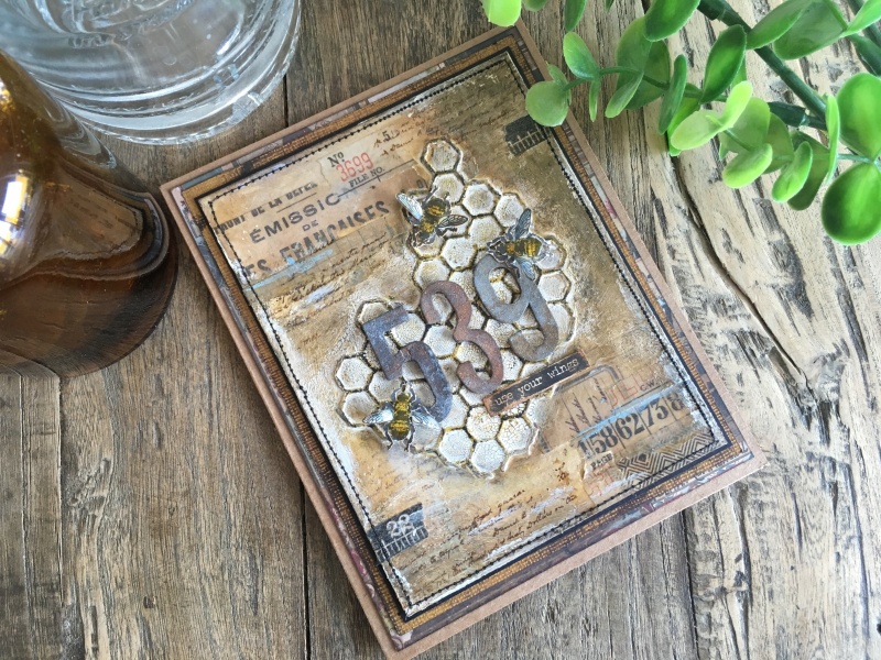
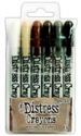
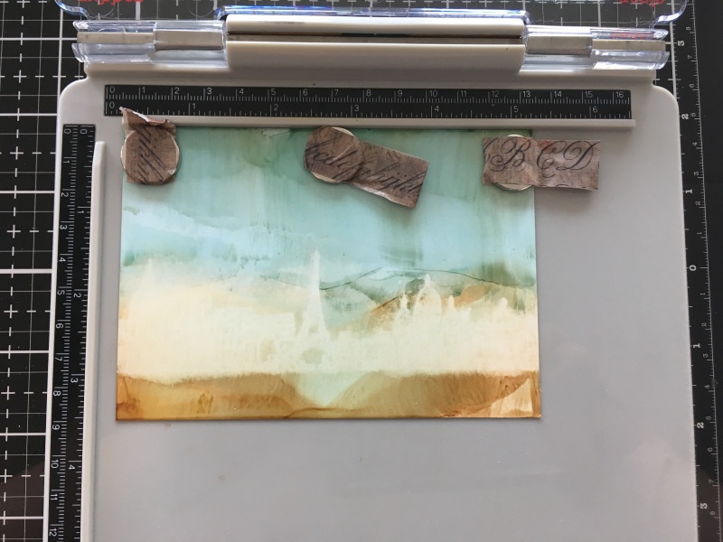
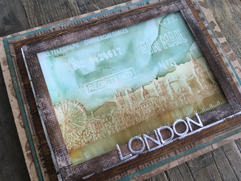
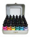
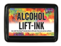
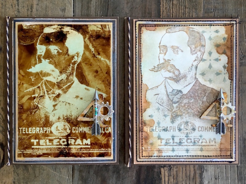
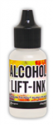
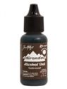
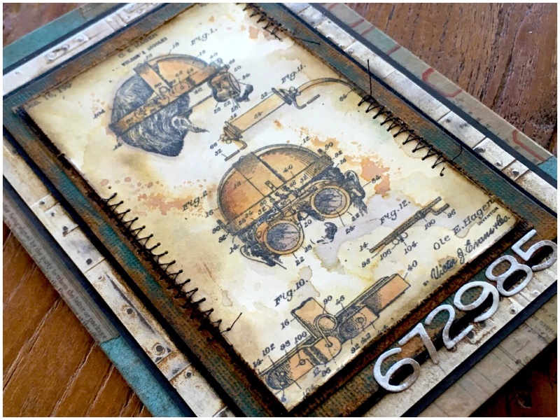
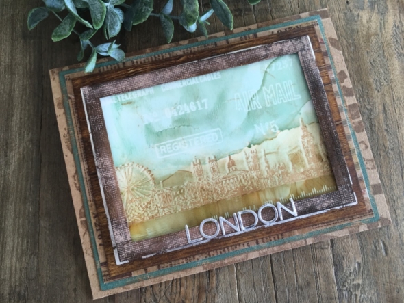
I was still playing with the new Tim Holtz Alcohol Lift-ink, so decided to incorporate that into my challenge project.
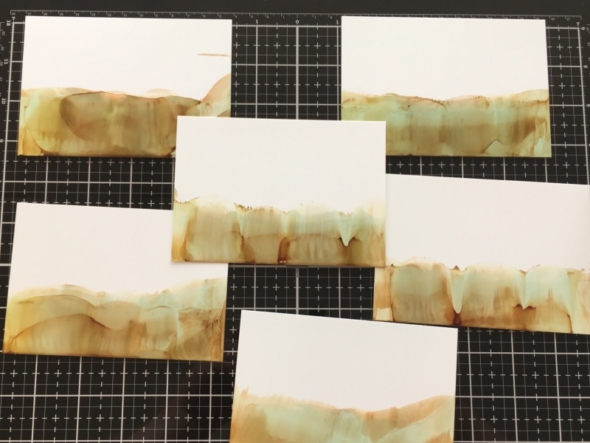
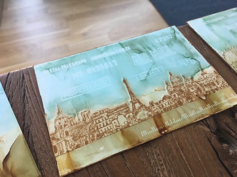
I needed several cards so made a background for each cityscape stamp, plus a spare for testing. I dropped alcohol ink onto my glass media mat, added a few drops of alcohol blending solution and swiped yupo heavystock through it.

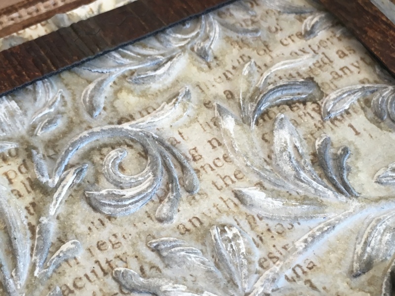
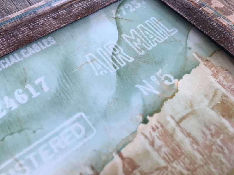
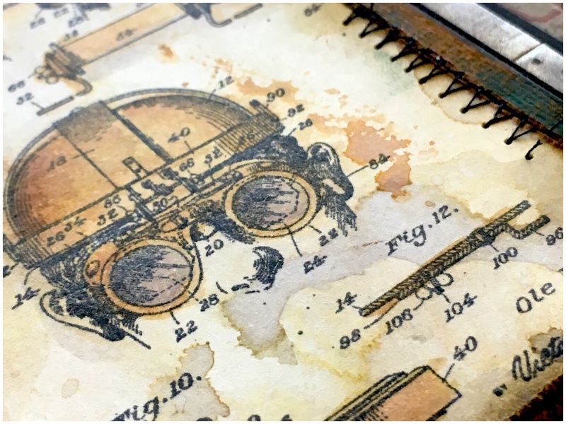
I wanted to experiment and see if I could use the lift-ink to create a ghost background by rubbing the lift-ink off immediately after it was stamped to smudge the image and create a light background in the shape of the stamped image.

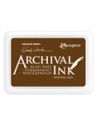
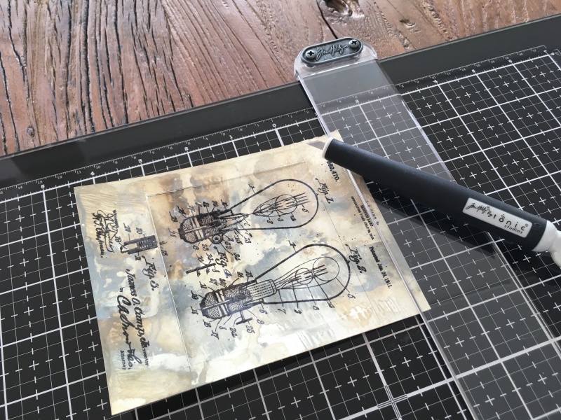
I then stamped over the top with archival ink to give the detailed stamped image, but this time left to air dry, (FOR HOURS)!
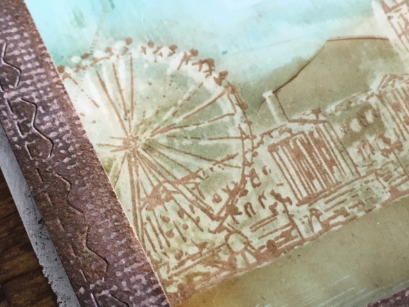
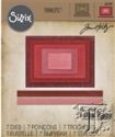
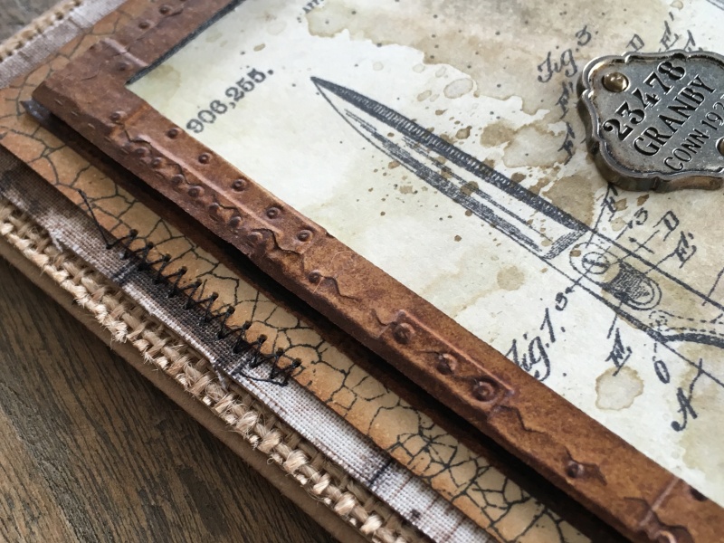
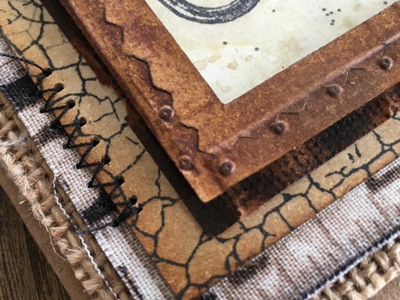
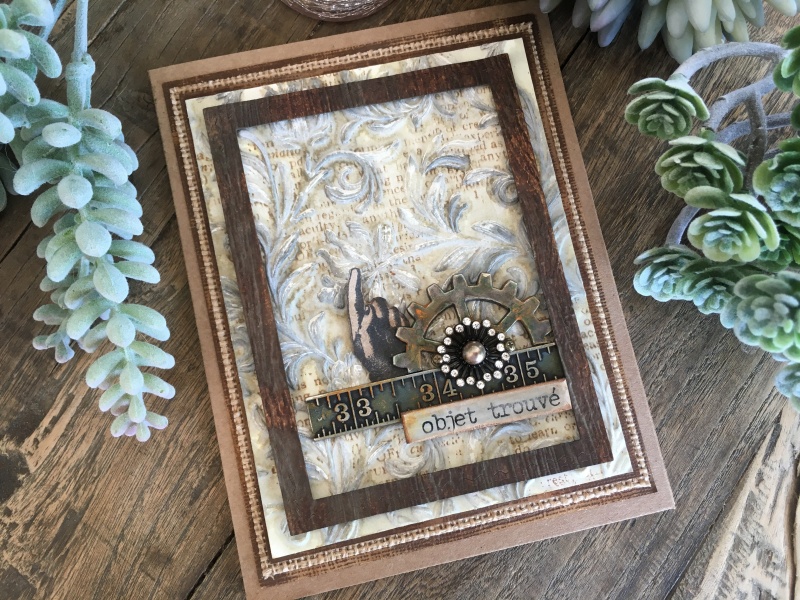
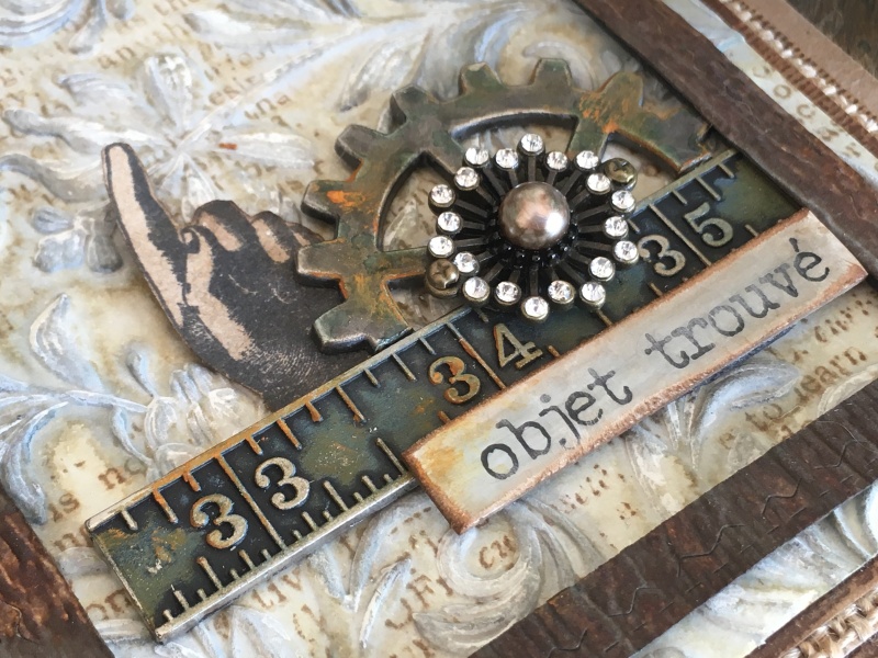
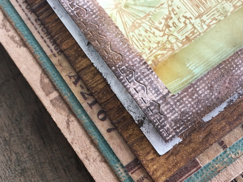
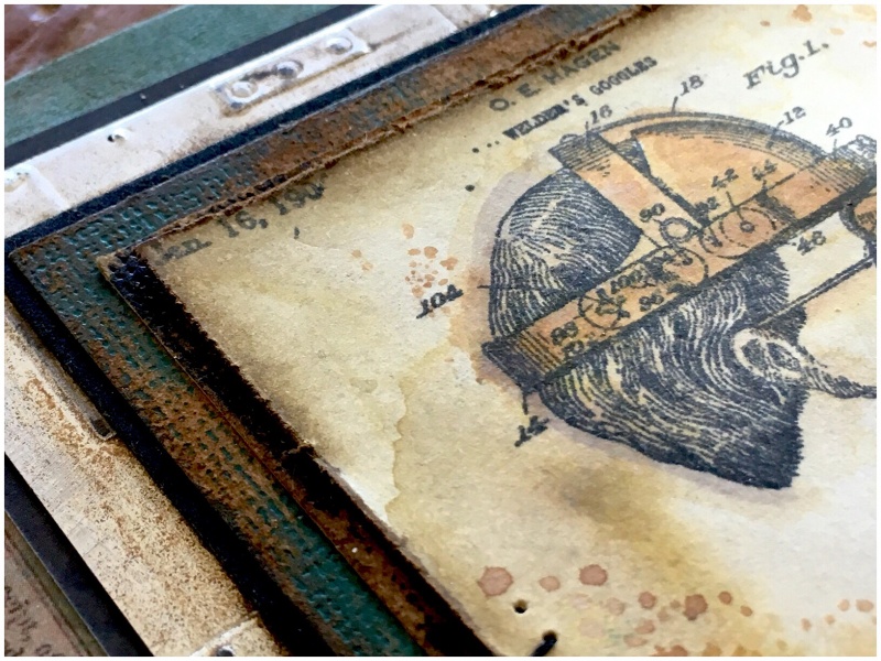
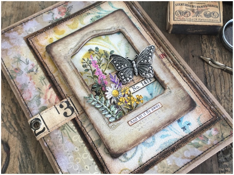
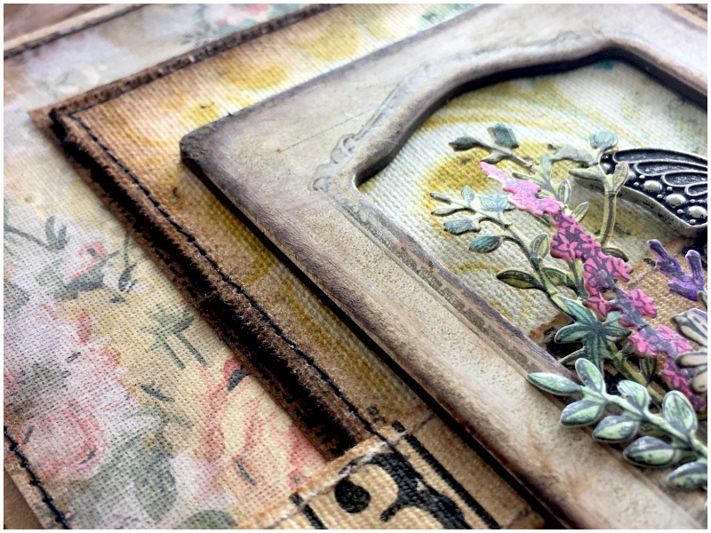
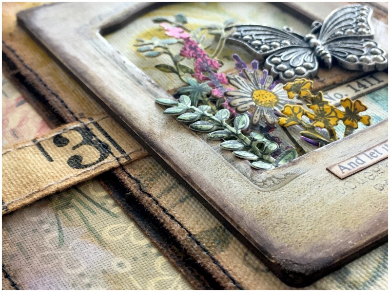
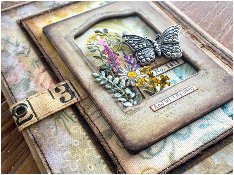
It’s still possible to smudge the image it you rub it… So, I created a frame using the stitched rectangle thinlits dies to prevent the image being touched (and smudged) too much. I’m all for “workarounds” 😉

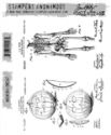
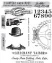
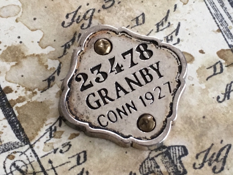
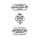
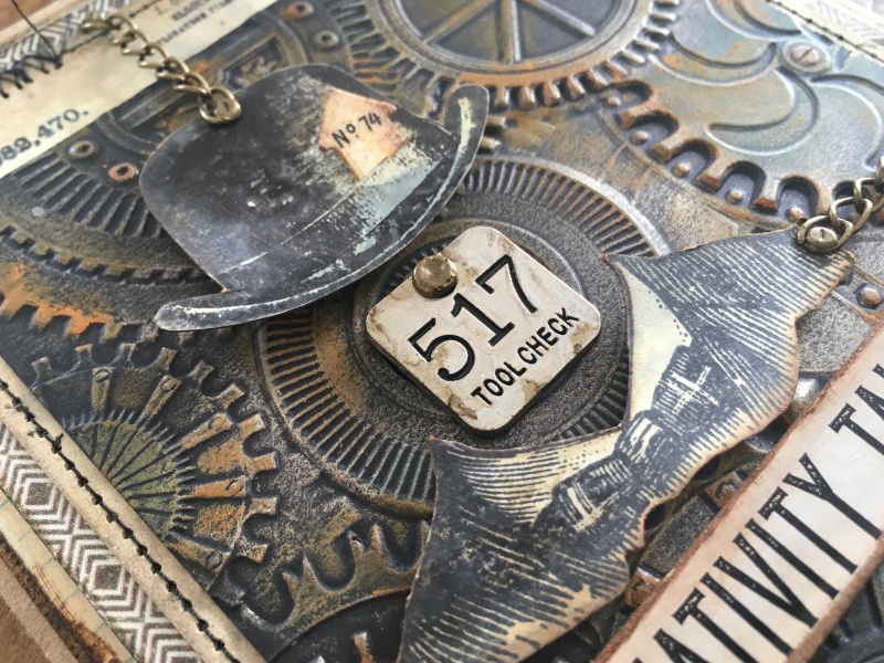
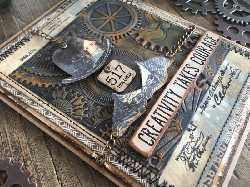
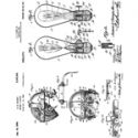
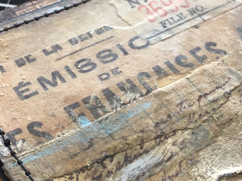
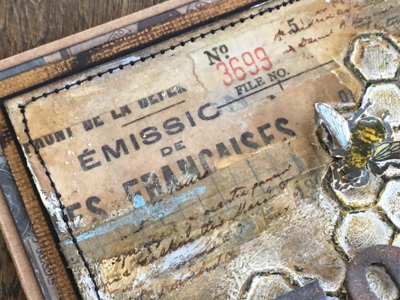
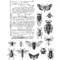
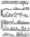
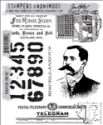
I used the traditional lift-ink technique to lift stamped images from the correspondence set (CMS225). This set reminds me of the vintage steamer travel trunks covered in labels, perfect for this theme.

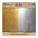
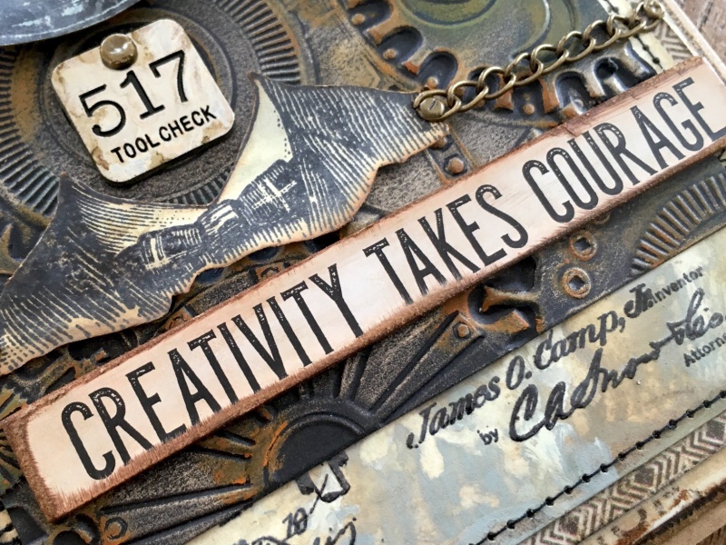
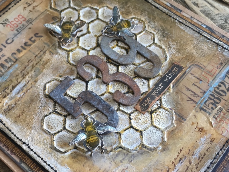
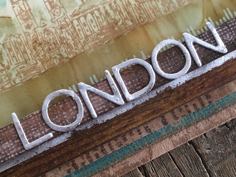
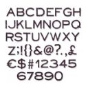
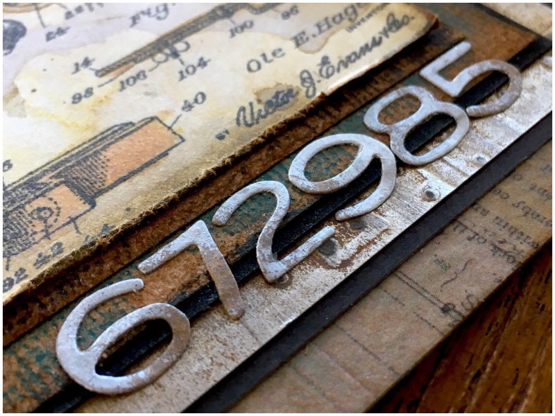
I added “LONDON” cut from metallic kraft stock with the alphanumeric thinlits die which has become a firm favourite for me, it just seems to always fit and I love the font.

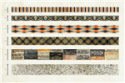
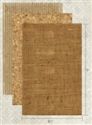
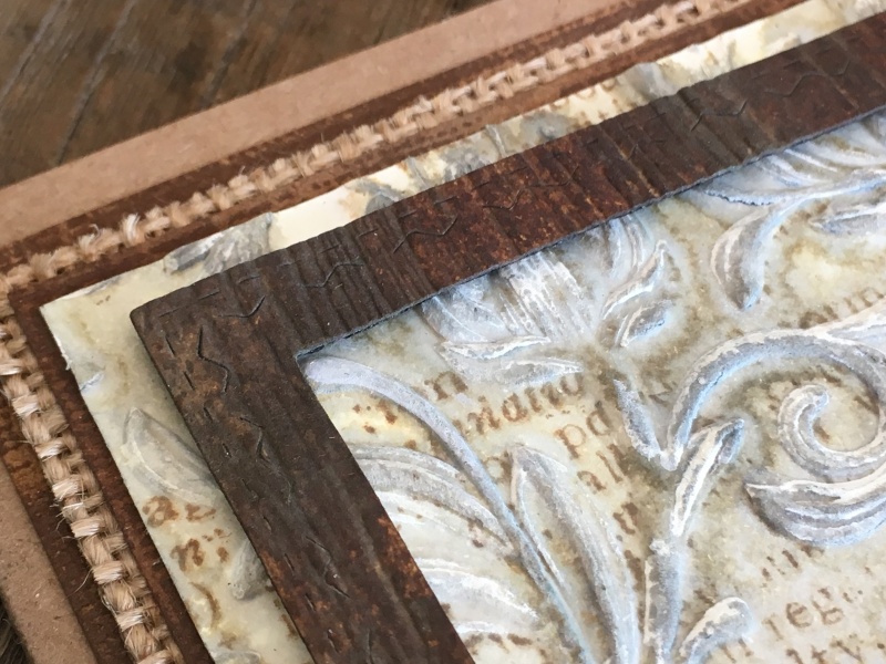
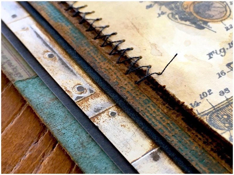
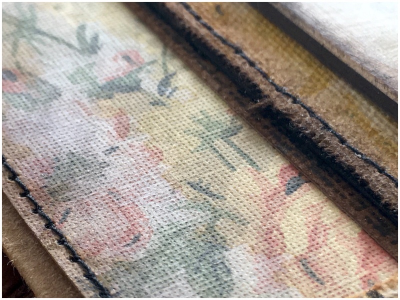
The mounts, from top to bottom:
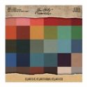
– stitched rectangles thinlits die cut frame from classic kraft stock
– metallic kraft stock
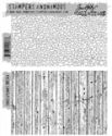
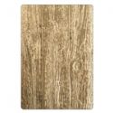
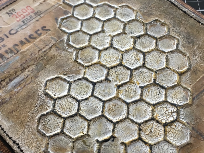
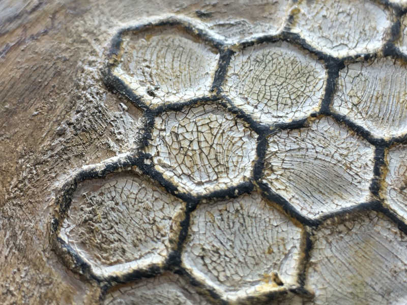
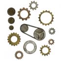
– heavystock embossed with the 3-D lumber texture fades
– scrap card covered with design tape
– classic kraft stock
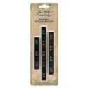
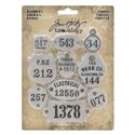
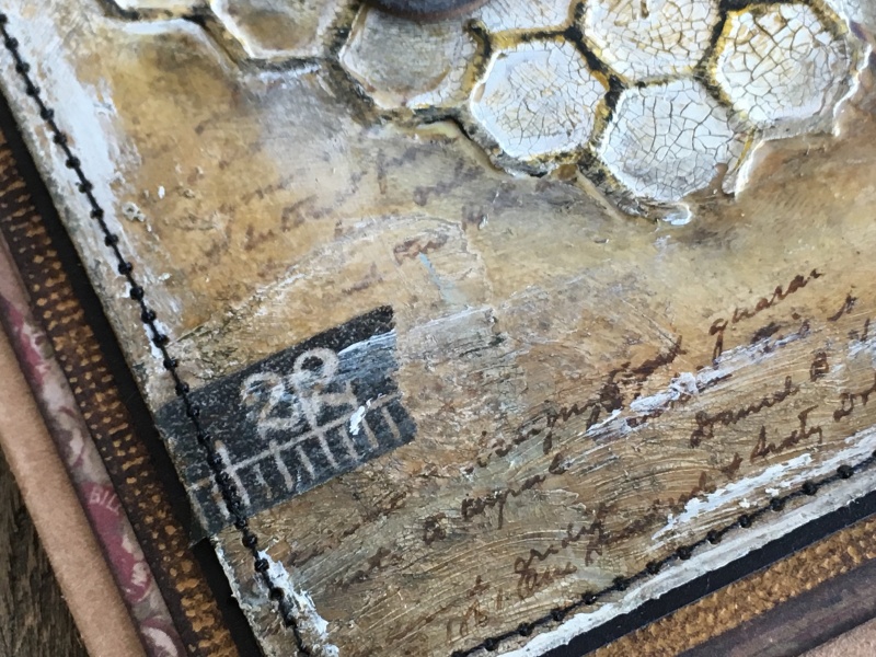
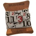
– kraft card with numbers stamped from the purveyor stamp set

Thanks for stopping by. I hope you will find time to join in the challenge and pop over to Frilly and Funkie challenge blog to see the rest of the DT’s projects. All the products I used are available from The Funkie Junkie Boutique.
Zoe