It’s Wednesday and time for the funkie side of the design team to share our projects for the current challenge over at the Frilly and Funkie Challenge Blog!
The current challenge is hosted by team member Sara Emily who has chosen the theme NEUTRAL POINT OF VIEW …Sara Emily says, “We’re seeing a lot of pastel and brighter colors this time of year. For this challenge we’re inviting you to step away from all that color and play with your neutral art supplies. You can add a few pops or hints of color, but be sure we see mainly neutrals on your vintage or shabby chic design. (Think black, white, gray, brown, beige, cream, ivory; even gold and silver.)”
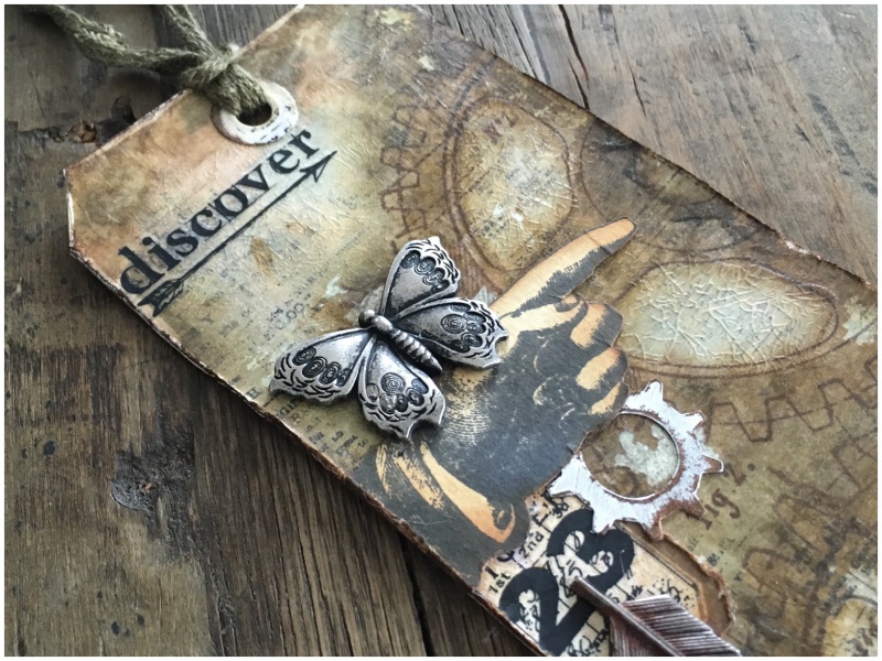
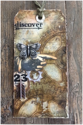 Okay, so this challenge was much easier for me than the last one. Neutral, (BROWN), is a colour palette I LOVE.
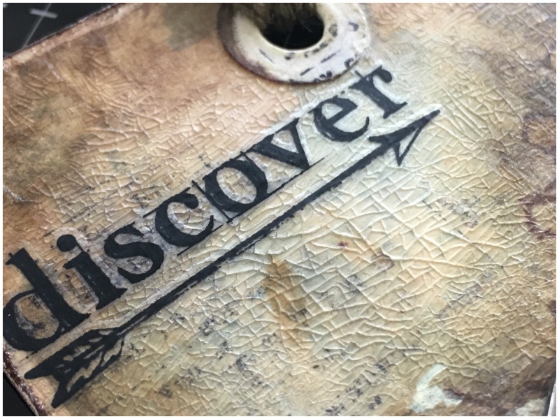
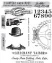
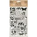
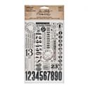
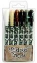
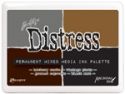
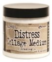
I used the distress crayon layered colouring technique from Tim Holtz Creative Chemistry 103 online class, with the addition of distress collage crazing medium over the top. I used dapper (CMS267) and newsprint (CMS266) stamps for the background and added a remnant rub.
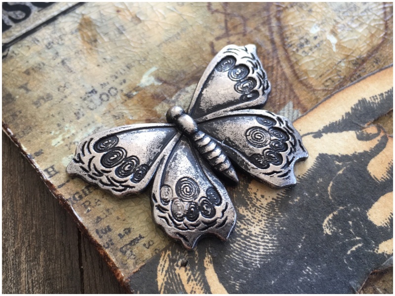
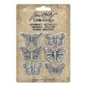
I am in love with the new idea-ology adornments butterflies! There are all sorts you can do to alter them but this time it needed the simplicity of being natural.
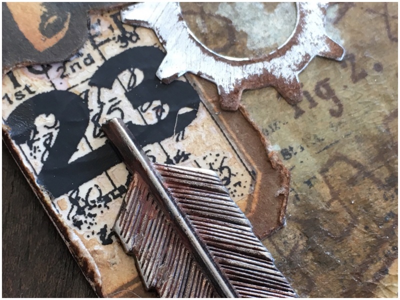
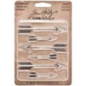
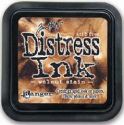
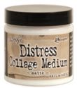
I also added a vial label with remnant rubs over the top and a die cut gear from metallic kraft stock and sanded. Both blended with walnut stain distress ink and adhered with distress collage matte medium. I added the bow end of an idea-ology adornments arrow.
Thanks for stopping by. I hope you will find time to join in the challenge and pop over to Frilly and Funkie challenge blog to see the rest of the DT’s projects. All the products I used are available from The Funkie Junkie Boutique.
Zoe
 |
 |
 |
 |
 |
 |
 |
 |
 |
 |
 |
 |
 |
 |
 |
 |
 |
 |
 |
 |
 |
 |
 |


Zoe, this is just fantastic! I often think that combining all neutrals is actually harder to work with than with colors. How to make the neutrals pop is the challenge! Love, love this!!! Great job girlie!
WONDERFUL! The Crazing is so cool over the background.
Love it! Great idea to crop the arrow…
This is awesome Zoe! TFS!
WoW Zoe – this is amazingly creative!! Love the grunge look 💗💗
Great piece Zoe, your work amazes me as always. Love the neutral colours and yes it’s tough to make things stand out, but you have succeeded again!!
Zoe, you do neutrals so well, this tag is stunning! The hand with the butterfly is so beautiful… x
Well, look at you! I swear I could eat this up! I was thinking of you when I chose my challenge theme, because I couldn’t wait to see what you would whip up! You did NOT disappoint! I’m loving that background with the best crazing I’ve ever seen! Looks like I’m going to have to take some Creative Chem. classes! Thank you for doing such a beautiful job with my challenge! I know you will inspire and WOW everyone. Hugs!
I’m totally with you on the ease of using this palette and just adore your crackley tag! The sawed off arrow, the “naked” butterfly, the subtle background stamping – all such incredible details! Totally love it! Hugs, Autumn
So beautiful, simply exquisite. I love your use of the neutral pallete and the crackle effect just adds that extra dimension. Thank you for the inspiration, creative hugs J x
Beautiful! I love the neutral palette too! I adore how you effortlessly pull together a lovely design and the elements in a visual treat for the eyes!
There is so much amazing depth to that inky background that I just sat here and drank it in. The crazing is …amazing. Your tag is proof that neutral is not boring. Love it…love everything you do!
I had to take another look–this is so good.