It’s Wednesday and time for another challenge over at Frilly and Funkie Challenge Blog! I’m delighted to be back on the Frilly & Funkie design team for another term. This week it’s the funkie side of the team to join the challenge.
This challenge is hosted by Suzz (Suzz’ Stamping Spot), who has chosen the theme WINTER HUES …SUZZ says, “The weather this time of year in the Midwest gets to be a bit chilly, icy, snowy and overcast. These elements of the season create a beautiful palette of colors which I am calling Winter Hues. This challenge requires you use any or all of the following colors: blue, white, silver, gray in your vintage or shabby chic project.”
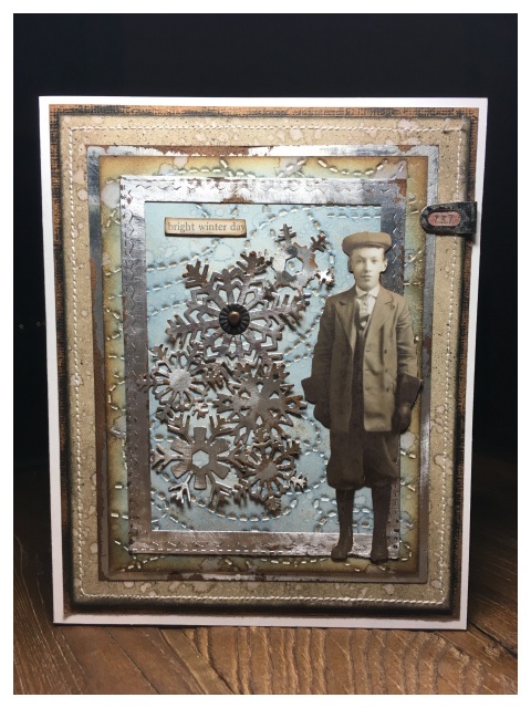 I love this challenge! I used blue, white, grey and silver in my card… and yes, brown, plenty of brown!
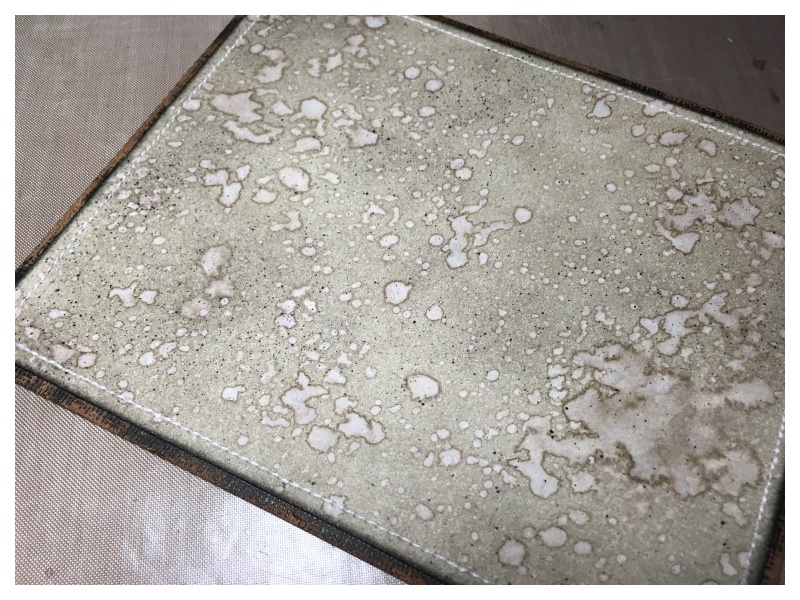
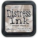
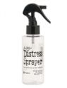
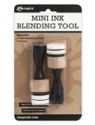
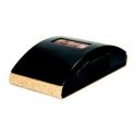
I worked in layers and blended pumice stone distress ink onto mixed media heavystock and spritzed with water. I love this technique and especially love the fantastic mottled effect the distress sprayer gives. I dried with a heat tool, stitched the edges with my sewing machine and mounted onto black core’dinations kraft core, which I sanded of course.
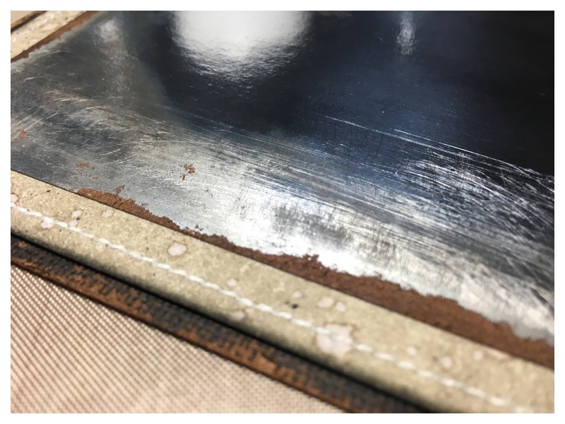
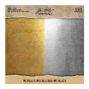
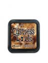
On top of that, I layered a piece of silver idea-ology metallic kraft stock. I sanded the edges with a sanding grip and blended in vintage photo distress ink.
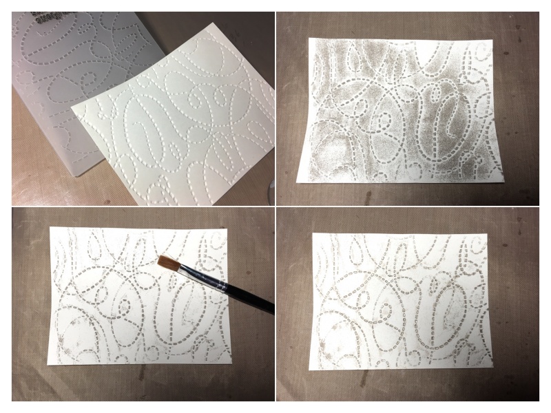
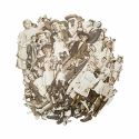
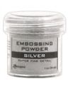
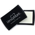
For the next layer wanted to try and recreate an embossed technique Tim Holtz demonstrated in Creative Chemistry 103 with the shadow press. It didn’t work exactly as I had hoped, but I managed to make it work for me, and quite liked the effect. I rubbed a versamark ink pad over the raised portion of the embossing folder and ran it through my big shot with mixed media heavystock. I then poured embossing powder over the top. This is where it didn’t work properly… I can’t find my brayer, I had it at the weekend but now it’s MIA and when I used the versamark ink pad it touched the flat portions of the folder and there was embossing powder everywhere! Using a dry paintbrush, I carefully brushed the powder off the negative portions and melted the powder with a heat tool.
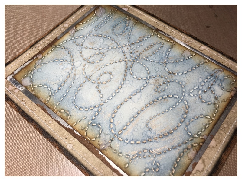
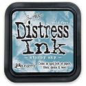
I blended stormy sky distress ink onto the card, edged with vintage photo distress ink and spritzed with water. I used this particular embossing folder as it reminded me of the cold winds blowing. I was pleased with the effect as there is powder in the debossed detail and a little splattered around which looks like it was an “on purpose!” I am trying SO hard to “embrace imperfection” and not “freak my freak” as Tim says in Creative Chemistry.
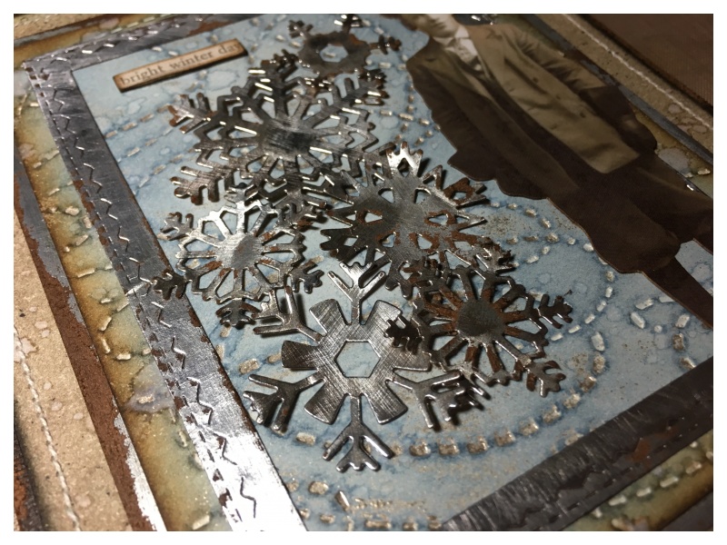
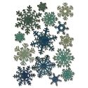
Next, I die cut a stitched rectangle frame and snowflakes with more of the silver idea-ology kraft stock. Sanded with a sanding grip and blended in vintage photo distress ink. I adhered them with glossy accents.
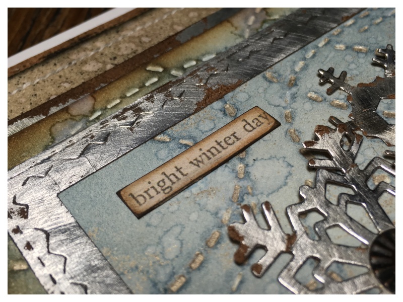
I added a sentiment from the new idea-ology clipping stickers. I sanded the edges and blended with vintage photo distress ink. This sentiment just worked perfectly with the frosty cold colours.
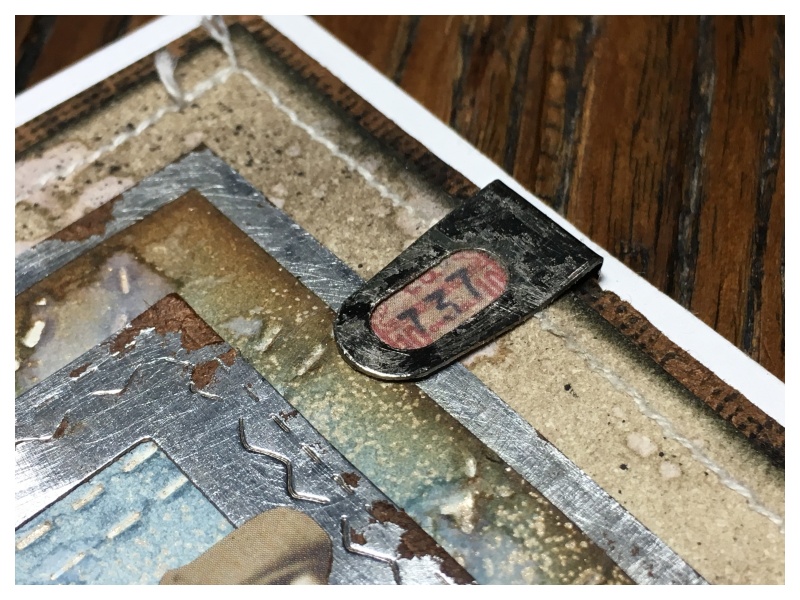
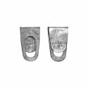
I also added a new idea-ology adornment index clips which I LOVE LOVE LOVE! I mounted it over a scrap of ephemera I had leftover from another project! Did I mention LOVE?!
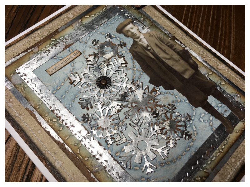
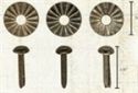
Finally I added an idea-ology fluted fastener to the center of the largest snowflake which I flattened with a hammer. My favourite bit though, was adding a new idea-ology paper doll! There are no words to truly describe how much I love these!
Thanks for stopping by. I hope you will find time to join in the challenge and pop over to Frilly and Funkie challenge blog to see the rest of the DT’s projects. All the products I used are available from The Funkie Junkie Boutique.
Zoe
 |
 |
 |
 |
 |
 |
 |
 |
 |
 |
 |
 |
 |
 |
 |
 |
 |
 |
 |
 |


Absolutely beautiful! I love how you used brown too! I didn’t mention it but truly our winters have lots of brown mixed in when the snow melts off! Love how you created that beautiful texture in the layers!
This really is beautiful Zoe – my favourite bit is the de-bossed happy accident, it looks amazing and I can see why you love the index clips so much, it makes a great finishing touch! As you know, British winters tend to be largely brown, so you have captured that very well indeed – lol! Anne x
I do love your art Zoe, I like the colours you choose and the subjects and well, everything. I can’t wait to see what you have in store for us this year!!
This project turned out wonderful! I love how you sanded the metallic Kraft core and then inked it. You have a gift for layering things u,p it all ties together so well. I have never had success with embossing the debossing even with a brayer, this turned out really well! The only thing you need embrace is the beauty! Thanks so much for sharing your talent.
Oh wow. This is fascinating and fabulous. Thank you for the great tutorial, too.
Very cool Zoe! I love the metallic layers with that fab image. Hugs, Autumn
Wow, wow, wow! This is magnificent, Zoe! I love all the distressed layers, the wonderful stitching, the fabulous embossing and that gorgeous cluster of glittery snowflakes. Your eye for detail never disappoints. Such a great, vintage creation! Thanks for sharing your process, too!
Wow! I really love how the embossing turned out, very cool! Great use of cool colors and awesome layers. I love the new Paper Dolls too. Can’t wait to get them in the store – just a few weeks from now! Super make, Zoe!
Zoe thanks for the awesome tutorial and pictures…awesome