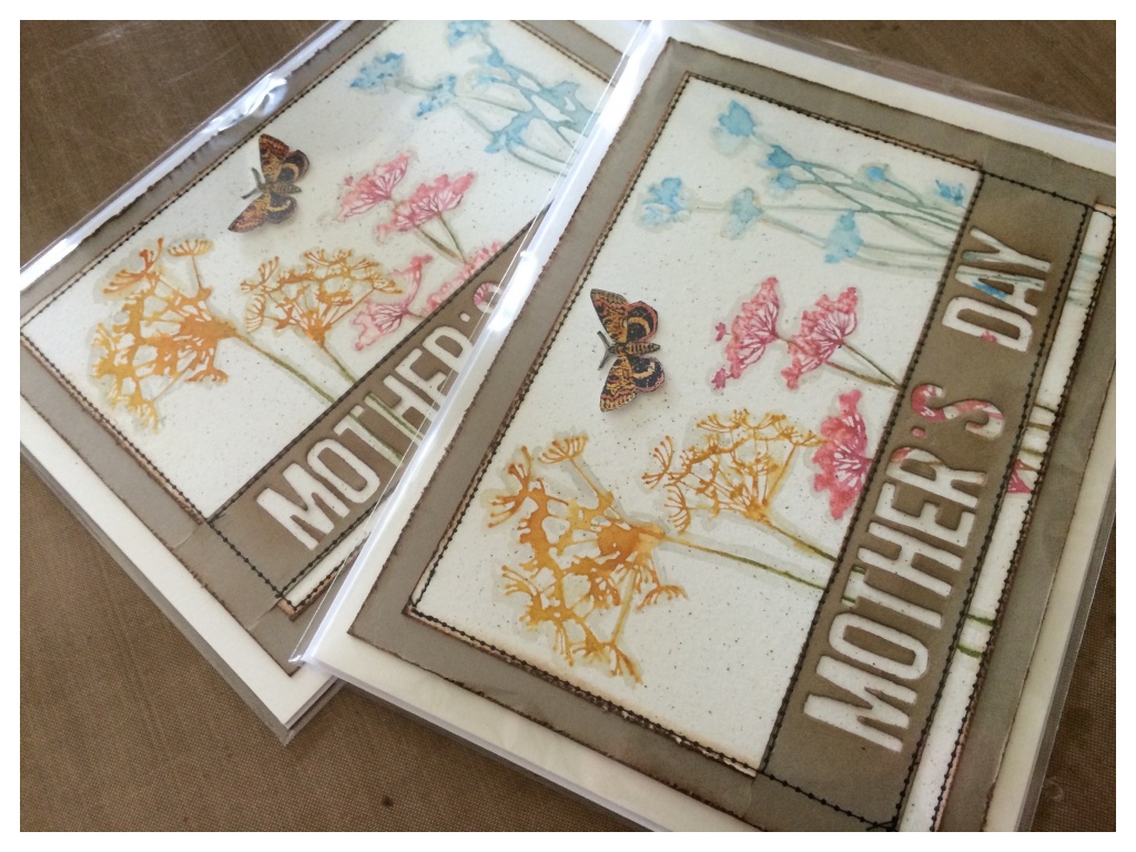
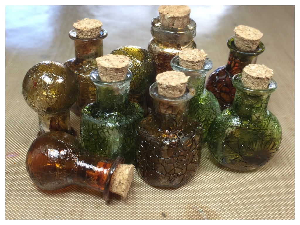
At the beginning of the month I made a July 4th wall hanging inspired by Tim’s July Tag. Since then Tim has announced his new Halloween products as well as some awesome accessory stamps and dies for those crazy birds we’ve all gone crazy over. It was all the excuse I needed…
I have been so inspired by Richele Christensen’s awesome crazy bird cards, (complete with names and personalities), that I had to create my own.
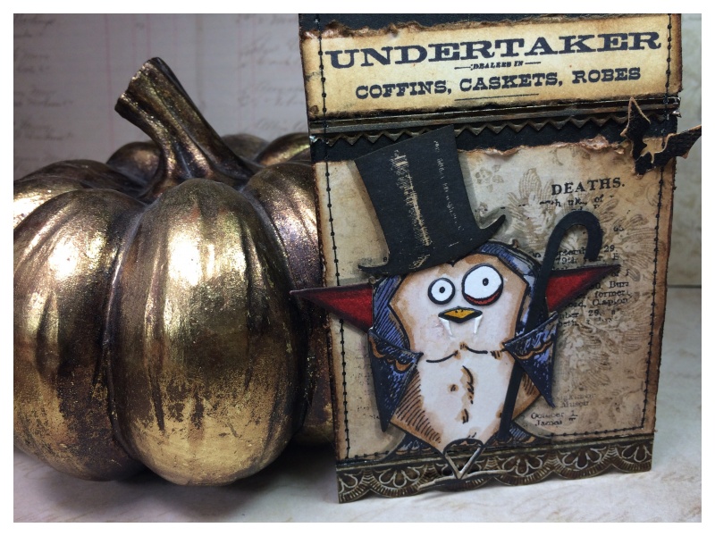
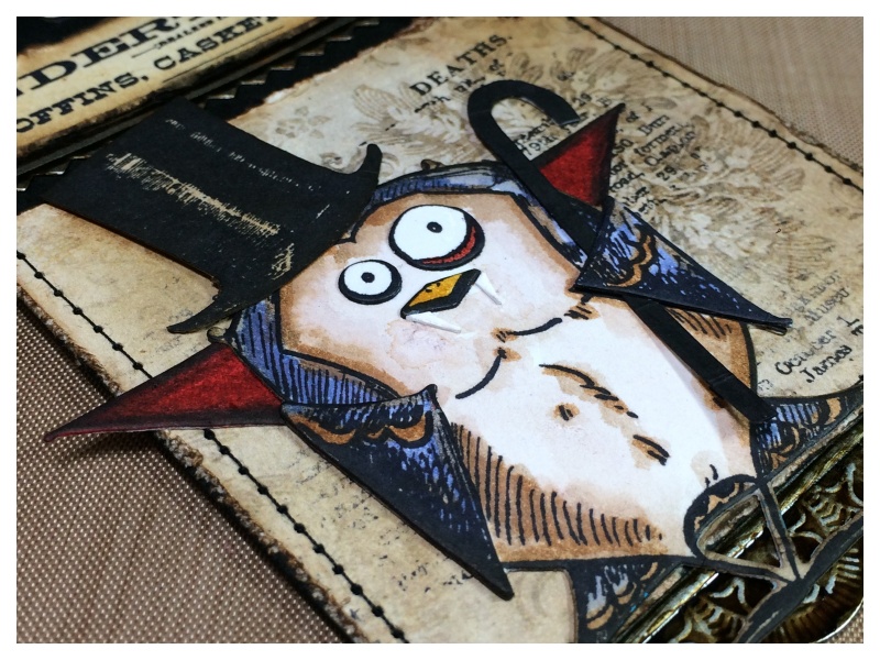
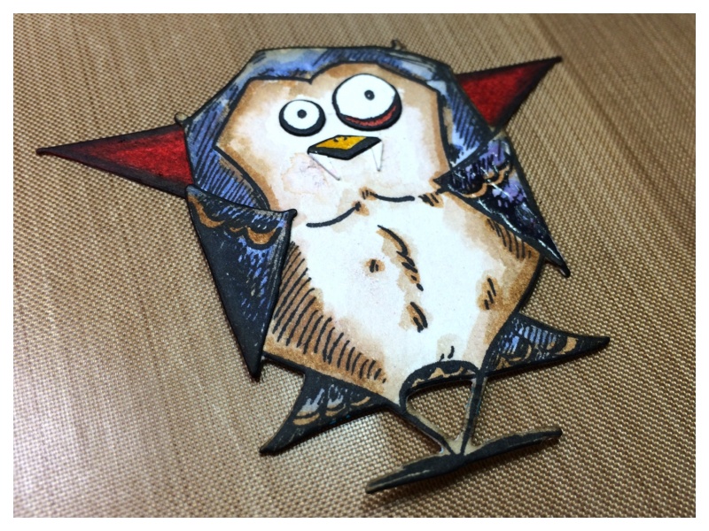
…May I introduce, “Count Peckula,” an Undertaker from Twittervania. 😉
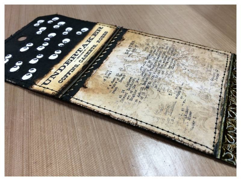
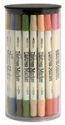
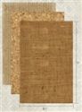
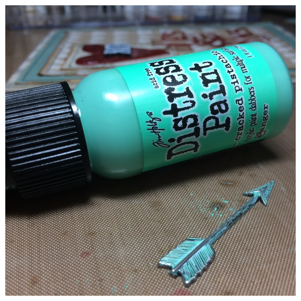
The base is black soot distress spray stain sprayed on a manila tag and watercolor cardstock and paper from the industrial stash, stamped with the new Undertaker set.
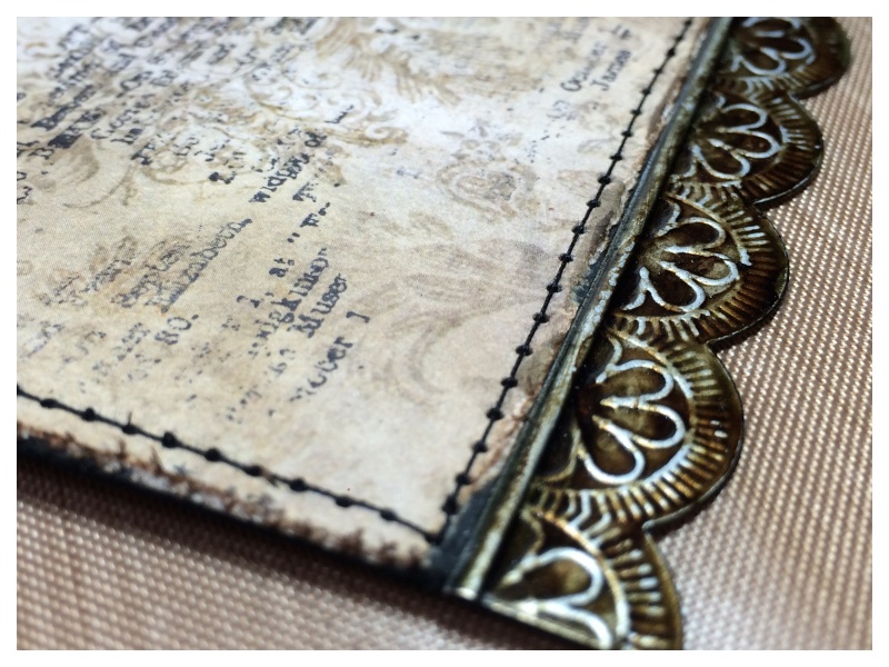
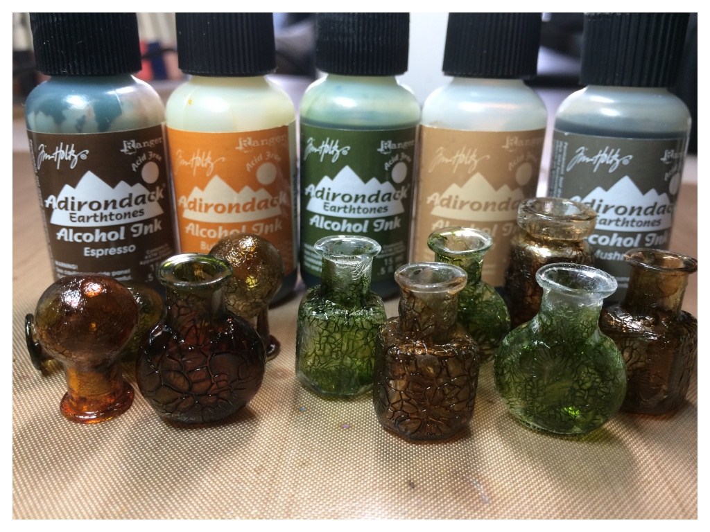
The tag is edged with idea-ology industrious stickers, covered with a little mushroom and espresso alcohol ink and stitched.
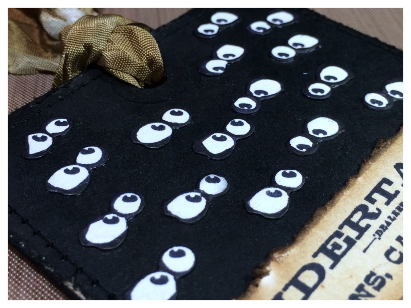
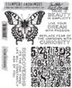
I wanted to give the impression of lots of bats hiding in the dark, so stamped the bird crazy eyes onto watercolor cardstock lots of times and cut with the corresponding die. I edged the eyes with black soot distress marker to fully immerse them into the dark background.
This is how I made Count Peckula…
See a video on how to create the base bird here!
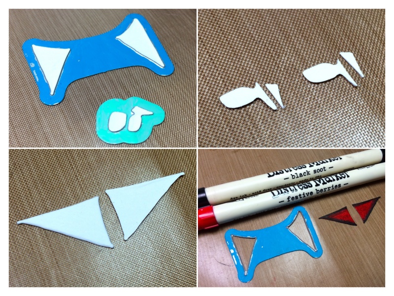
CAPE POINTS: die cut an additional set of wings from watercolor cardstock, colour with festive berries and edge with black soot distress markers.
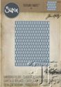
VAMPIRE FANGS: die cut using the die pictured from watercolor cardstock, trim (as pictured) to create the fangs.
WALKING STICK & TOP HAT: stamp the candy cane from the new crazy things stamp set and elongated the stem with a journaling pen. Coloure with the black soot distress marker to cover the candy cane stripes. Stamp the top hat from the Undertaker stamp set.
Attach the cape points and the vampire fangs with a dab of glossy accents and then cover the vampire fangs with glossy accents to give an enameled look.
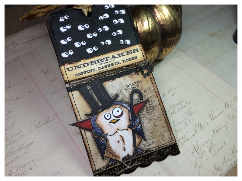
Thanks for taking the time to look at my tag. You can see this months tag and techniques on Tim’s blog.
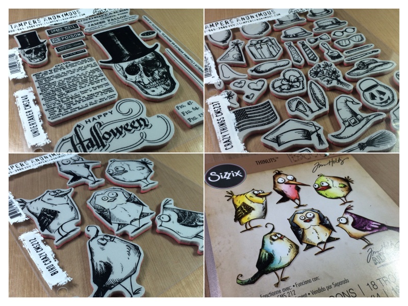
CMS #240 Undertaker / CMS#237 Crazy Things / CM#212 Bird Crazy / #660954 Bird Crazy Thinlit Dies